Focus: Designing digital maps, spatial visualizations, story maps, dashboards, and interactive GIS tools.
Responsibilities
- Provide text descriptions or data summaries for maps and layers.
- Ensure map legends, filters, and controls are labeled clearly.
- Ensure pop-ups, tooltips, and layer controls are keyboard accessible.
- Avoid color-only differentiation in maps (provide patterns or labels).
- Provide accessible alternatives for complex spatial data.
- Ensure dashboards and map layouts adapt on smaller screens.
- Test panning, zooming, and pop-ups for keyboard accessibility.
- Test keyboard-only navigation and ensure there are no traps or dead ends.
Relevant WCAG 2.1 new success criteria
The success criteria states that content does not restrict its view and operation to a single display orientation, such as portrait or landscape, unless a specific display orientation is essential.
Note: Examples where a particular display orientation may be essential are a bank check, a piano application, slides for a projector or television, or virtual reality content where content is not necessarily restricted to landscape or portrait display orientation.
Key takeaway: Content must not lock orientation. Users should be able to view visualizations in either portrait or landscape unless essential.
Sufficient techniques:
How it applies to Maps/GIS
- Make sure maps, dashboards, and geospatial interfaces resize and remain functional whether the device is portrait or landscape.
- Avoid fixed width map layouts that break when orientation changes.
- Reflow side panels, legends, filters, and layer controls to appropriate positions when orientation shifts.
The success criteria states that the purpose of each input field collecting information about the user can be programmatically determined when:
- The input field serves a purpose identified in the Input Purposes for user interface components section; and
- The content is implemented using technologies with support for identifying the expected meaning for form input data.
Key takeaway: Input fields must expose standardized purposes (autocomplete types) that browsers and assistive technology can understand. GIS UIs that include forms, filters, or search inputs must be labeled semantically and programmatically.
Sufficient techniques
How it applies to Maps/GIS
- Apply proper autocomplete attributes such as:
- autocomplete=”name”
- autocomplete=”email”
- autocomplete=”address-line1”
- Avoid custom widgets that mask fields or block user agents from detecting field purpose.
- Give geocoding search fields correct labeling (“Search location” or “Enter address”).
Tools
- Test using Dev Tools within your browser (right-click and select inspect).
The success criteria states that content can be presented without loss of information or functionality, and without requiring scrolling in two dimensions for:
- Vertical scrolling content at a width equivalent to 320 CSS pixels;
- Horizontal scrolling content at a height equivalent to 256 CSS pixels.
Except for parts of the content which require two-dimensional layout for usage or meaning. An example is Maps.
Key takeaway: Users must be able to zoom to 400% or use maps without losing functionality and not have to scroll horizontally to see any part of the map element.
Sufficient techniques
- Using media queries and grid CSS to reflow columns
- Using CSS Flexbox to reflow content
- Allowing for reflow with long URLs and strings of text
- Using CSS width, max-width and flexbox to fit labels and inputs
- Calculating size and position in a way that scales with text size
How it applies to Maps/GIS
- Applications should be responsive with different screen widths and the browser’s zoom without the use of horizontal scrolling.
- Vertical scrolling may be appropriate if the map is part of vertically scrolling content, in which case two-finger panning should be available.
- If buttons overlap on zoom, move all buttons to a single “tools” button that expands to a variety of tool selections.
- Avoid using a static image for a legend when possible and use images for individual symbols on legend items instead.
Tools
- Manually test by using browser zoom to zoom in to 400%.
The success criteria states that the visual presentation of the following have a contrast ratio of at least 3:1 against adjacent color(s):
- User Interface Components: Visual information required to identify user interface components and states, except for inactive components or where the appearance of the component is determined by the user agent and not modified by the author;
- Graphical Objects: Parts of graphics required to understand the content, except when a particular presentation of graphics is essential to the information being conveyed.
Key takeaway: Non-text elements (such as icons, charts, graphs, diagrams, data points) must be visually recognizable.
Sufficient techniques
- For user interface components:
- For graphical content:
How it applies to Maps/GIS
- When selecting color palettes, ensure that each data series meets the 3:1 contrast ratio relative to its background and adjacent elements.
- Avoid relying only on faint color differences to differentiate series — use patterns, markers, shapes, and outlines.
- Add borders or outlines around low-contrast elements when necessary.
- When creating thematic maps, avoid using color ramps that collapse into low-contrast tones.
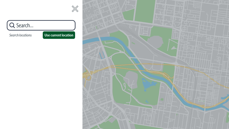
Button color contrast failure
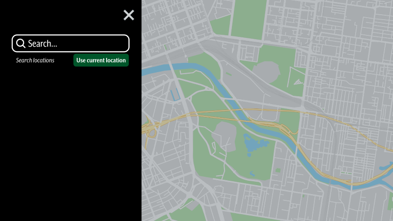
Button color contrast success
Tools
Exceptions
- If a graphic contains text that is embedded or overlayed and conveys the same information. An example would be the labels and values on a bar graph.
- The graphic does not convey any meaningful information and is for decorative purposes only.
- The information is available in another form.
- The graphic is part of a logo or brand name.
The success criteria states that in content implemented using markup languages that support the following text style properties, no loss of content or functionality occurs by setting all of the following and by changing no other style property:
- Line height (line spacing) to at least 1.5 times the font size;
- Spacing following paragraphs to at least 2 times the font size;
- Letter spacing (tracking) to at least 0.12 times the font size;
- Word spacing to at least 0.16 times the font size.
Exception: Human languages and scripts that do not make use of one or more of these text style properties in written text can conform using only the properties that exist for that combination of language and script.
Key takeaway: Layer lists, legends, pop-ups, and attribute tables must be created with flexible spacing; not fixed line height paragraphs or tightly packed text boxes. Users must be able to increase text spacing without breaking the layout.
Sufficient techniques
How it applies to Maps/GIS
- Pop-up text shouldn’t overflow when spacing increases.
- Style legend items with flexible spacing by avoiding pixel-perfect vertical alignment.
- On-map labels like street names and boundaries should not overlap when spacing changes within UI panels.
- Avoid formatting text inside images; use real text whenever possible (e.g., map screenshots).
Tools
- Use the browser’s zoom controls to magnify the content to test for any overlapping. Note if there’s any horizontal scrolling necessary to read the text.
The success criteria states where receiving and then removing pointer hover or keyboard focus triggers additional content to become visible and then hidden, the following are true:
- Dismissible: A mechanism is available to dismiss the additional content without moving pointer hover or keyboard focus, unless the additional content communicates an input error or does not obscure or replace other content;
- Hoverable: If pointer hover can trigger the additional content, then the pointer can be moved over the additional content without the additional content disappearing;
- Persistent: The additional content remains visible until the hover or focus trigger is removed, the user dismisses it, or its information is no longer valid.
Exception: The visual presentation of the additional content is controlled by the user agent and is not modified by the author.
Key takeaway: when additional content appears on hover or focus, like map pop-ups, hover info, and data point details, it must remain visible when the pointer is over it, not disappear immediately when moving to the tooltip, and be dismissible.
Sufficient techniques
How it applies to Maps/GIS
- Ensure tooltips and pop-ups remain open long enough for reading.
- Enable keyboard access to tooltip-triggered insights.
- Avoid hover-only access — provide click or focus equivalents.
- Provide tooltip information in another way when possible, like directly in the webpage or in an accessible PDF.
Tools
- Manually test the page with keyboard navigation (Tab / Shift+Tab) and note any content that appears and disappears when focused on specific elements.
The success criteria states that if a keyboard shortcut is implemented in content using only letter (including upper- and lower-case letters), punctuation, number, or symbol characters, then at least one of the following is true:
- Turn off: A mechanism is available to turn the shortcut off;
- Remap: A mechanism is available to remap the shortcut to include one or more non-printable keyboard keys (e.g., Ctrl, Alt);
- Active only on focus: The keyboard shortcut for a user interface component is only active when that component has focus.
Key takeaway: Single-character keyboard shortcuts must be reversible or only work when an element has focus. If a Map interface uses key presses (e.g., Z=zoon, D=delete), they must not trigger unexpectedly.
Sufficient techniques
How it applies to Maps/GIS
- Make sure character-only shortcut keys can be turned off/modified using one or more modifier keys.
- Scope shortcuts to focused elements only.
- Test different devices and assistive technologies to check for any accidental keyboard shortcut triggers.
Tools
- If information on shortcut keys is not available, check code for shortcut keys or manually search for them using the keyboard for every character.
The success criteria states that all functionality that uses multipoint or path-based gestures for operation can be operated with a single pointer without a path-based gesture, unless a multipoint or path-based gesture is essential.
Note: This requirement applies to web content that interprets pointer actions (i.e., this does not apply to actions that are required to operate the user agent or assistive technology).
Key takeaway: Complex gestures like pinch, rotate, or two-finger pan cannot be the only method for interacting with content. Maps often rely on gestures, but there must be alternatives.
Sufficient techniques
- Providing controls to achieve the same result as path based or multipoint gestures
- Providing single point activation for a control slider
How it applies to Maps/GIS
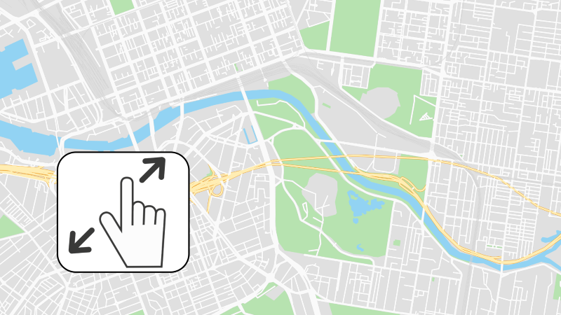
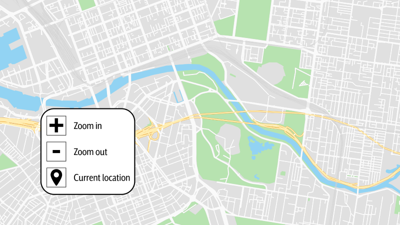
- Avoid requiring pinch-zoom as the only option for map navigation. Also provide zoom buttons (in + / out -).
- Provide panning with arrow keys or on-screen controls
- Make sure map rotations can be toggled or disabled.
Pointer gesture failure (requires pinch-zoom)
Pointer gesture success (zoom options provided)
The success criteria states that for functionality that can be operated using a single pointer, at least one of the following is true:
- No Down-Event: The down-event of the pointer is not used to execute any part of the function;
- Abort or Undo: Completion of the function is on the up-event, and a mechanism is available to abort the function before completion or to undo the function after completion;
- Up Reversal: The up-event reverses any outcome of the preceding down-event;
- Essential: Completing the function on the down-event is essential.
Key takeaway: Users must be able to cancel or avoid accidental activation of touch interactions. A tap should not trigger immediate irreversible action.
Sufficient techniques
- Ensuring that drag-and-drop actions can be cancelled
- Using native controls to ensure functionality is triggered on the up-event.
How it applies to Maps/GIS
- Allow users to review and confirm their action before critical information is submitted.
- Prevent accidental activation when dragging or touching data points.
- Manually review your application and make sure all necessary pointer cancellations are there.
The success criteria states that for user interface components with labels that include text or images of text, the name contains the text that is presented visually.
Note: A best practice is to have the text of the label at the start of the name.
Key takeaway: The visible text label must match the accessible name used by assistive technologies. This includes buttons, toggles, legends, filters, and map tools.
Sufficient techniques
- Including the text of the visible label as part of the accessible name
- Matching the accessible name to the visible label
How it applies to Maps/GIS
- Legends must match their spoken names for people relying on voice recognition software to access and use controls such as buttons, drop-down menus, check boxes, and filters.
- Example: If the visible text on a drop-down menu says “Filter,” the accessible name should also be “Filter” and not “Refine Results.”
- Correct HTML:
- <label for=”filters”>Filters</label>
- <select id=”filters” name=”filters”>
- Incorrect HTML:
- <label for=”filters”>Filters</label>
- <select id=”filters” name=”Refine Results”>
The success criteria states that functionality that can be operated by device motion or user motion can also be operated by user interface components and responding to the motion can be disabled to prevent accidental actuation, except when:
- Supported Interface: The motion is used to operate functionality through an accessibility supported interface;
- Essential: The motion is essential for the function and doing so would invalidate the activity.
Key takeaway: If your application uses device motion for interactions (such as shaking, tilting, rotating, etc.), users must have non-motion alternatives and be able to turn off motion controls.
Sufficient techniques
How it applies to Maps/GIS
- Do not rely on motion gestures for essential actions.
- Always provide standard UI alternatives for the same action:
- Buttons
- Keyboard commands
- Tap/click triggers
- Disable motion detection when the user turns on “Reduce Motion” system settings.
- Provide a toggle or preference setting to disable motion interactions.
- Avoid accidental triggers from unintended movement (e.g., slight shaking).
- Ensure motion events do not override assistive technologies or keyboard focus.
The success criteria states that in content implemented using markup languages, status messages can be programmatically determined through role or properties such that they can be presented to the user by assistive technologies without receiving focus.
Key takeaway: Screen reader users must be notified when meaningful changes happen in dashboards, charts, or map views without losing their keyboard focus.
Sufficient techniques
- If a status message advises on the success or results of an action, or state of an application:
- If a status message conveys a suggestion or warning on the existence of an error:
- Using ARIA role=alert or Live Regions to Identify Errors in combination with any of the following techniques:
- Providing text descriptions to identify required fields that were not completed
- Providing a text description when the user provides information that is not in the list of allowed values
- Providing a text description when user input falls outside the required format or values
- Providing suggested correction text
- Providing spell checking and suggestions for text input
- If a status message conveys information on the progress of a process:
How it applies to Maps/GIS
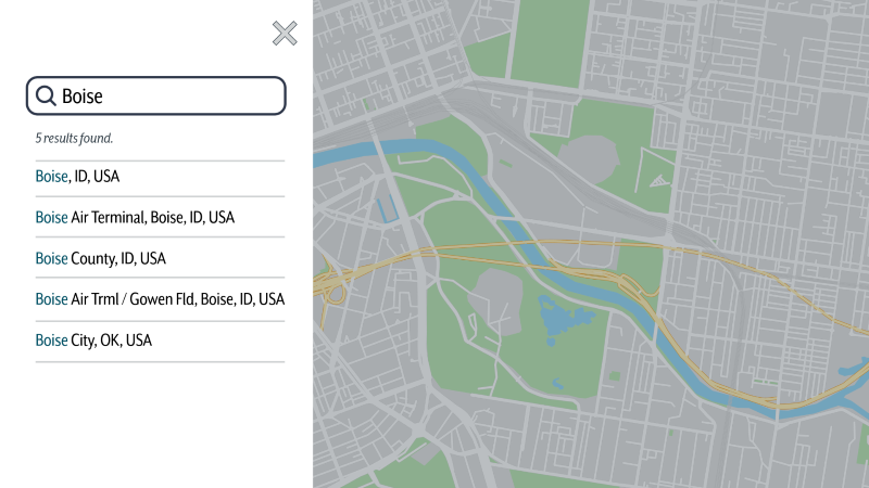
- After a user searches the map, a status message would indicate to the user that their search status is complete and include the number of search results found.
- For dynamic dashboards, announce data refreshes, applied filters, and errors or empty dataset states.
- Use short, meaningful status messages — not paragraphs of text.
- Include a status message that a PDF is ready to be downloaded if the user wants to print the map.
Status message success