Focus: Writing and maintaining content, links, images, headings, and documents within websites, intranet pages, digital services, and managing State of Idaho social media platforms.
Responsibilities
- Write clear, concise content using proper structure (headings, lists, tables).
- Provide meaningful alternative text for images and icons.
- Use descriptive link text that conveys purpose.
- Maintain consistent terminology, labels, and navigation cues.
- Ensure content remains readable with increased text size or spacing.
- Avoid providing instructions based solely on color, shape, position, or other visual cues that intend to guide action or behavior.
- Format documents (PDF, Word, Excel) using accessible templates and built‑in styling.
- Test forms for proper labels, instructions, and error messages.
- Review multimedia for captions, transcripts, and descriptions.


Social media-specific responsibilities
- Provide synchronized closed captions for all pre-recorded videos, as well as audio descriptions if visual-only elements convey information.
- Ensure transcripts or text alternatives are available for audio-only or video-only posts.
- Avoid flashing or rapidly moving visuals that can trigger seizures.
- Leverage social media platform accessibility features and routinely review platform features to adjust practices accordingly.
- Build accessibility checks and review into your publishing processes.
Relevant WCAG 2.1 new success criteria
Content Writers
The success criteria states that content can be presented without loss of information or functionality, and without requiring scrolling in two dimensions for:
- Vertical scrolling content at a width equivalent to 320 CSS pixels;
- Horizontal scrolling content at a height equivalent to 256 CSS pixels.
- Except for parts of the content which require two-dimensional layout for usage or meaning.
Key takeaway: Content must remain usable when viewed on small screens or large zoom (no horizontal scrolling).
Sufficient techniques
- Using media queries and grid CSS to reflow columns
- Using CSS Flexbox to reflow content
- Allowing for reflow with long URLs and strings of text
- Using CSS width, max-width and flexbox to fit labels and inputs
- Calculating size and position in a way that scales with text size
How it applies to content writers
- Write scannable, concise content that works in narrow columns.
- Design responsive layouts that stack elements.
- Ensure legends rewrap or convert to dropdowns when space is limited.
- Avoid static-width visuals that crop important data.
- Dashboard panels should reorganize logically (e.g., filters move above the visual).
Reflow failure (horizontal scrolling required)

Reflow success (no horizontal scrolling)

Tools
- Manually test by using browser zoom to 400%.
The success criteria states that the visual presentation of the following have a contrast ratio of at least 3:1 against adjacent color(s):
- User Interface Components: Visual information required to identify user interface components and states, except for inactive components or where the appearance of the component is determined by the user agent and not modified by the author;
- Graphical Objects: Parts of graphics required to understand the content, except when a particular presentation of graphics is essential to the information being conveyed.
Key takeaway: Non-text elements (such as icons, controls, charts, graphs, diagrams) must be visually recognizable. Writers often reference visual UI elements; clarity prevents misunderstanding for low-vision users.
Sufficient techniques
For user interface components:
- Using an author-supplied, visible focus indicator
- Providing a control with a sufficient contrast ratio that allows users to switch to a presentation that uses sufficient contrast
For graphical content:
- Ensuring that a contrast ratio of 3:1 is provided for icons
- Provide sufficient contrast at the boundaries between adjoining colors
How it applies to content writers
- When providing copy that includes embedded icons (e.g., “Select the ⚙ button”), ensure icons are meaningful and recognizable.
- Avoid relying solely on icons to convey critical instructions.
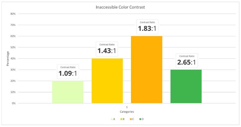
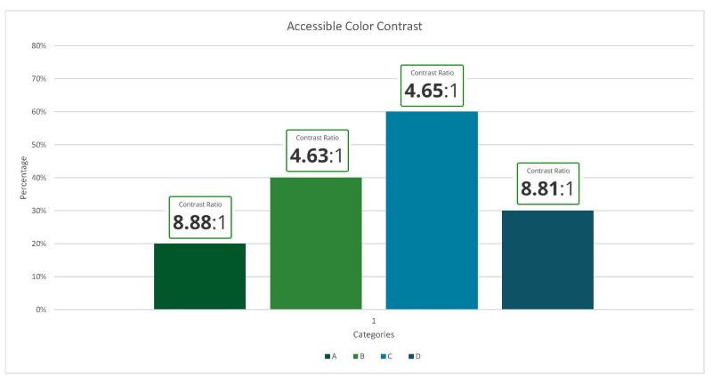
- When designing charts, graphs, or other elements in content, use high-contrast color palettes.
Graph color contrast failure
Graph color contrast success
Tools
Examples of graphics the success criterion applies to
Icons, graphs, diagrams, and infographics are examples of graphic objects that are composed of lines or shapes and a limited color palette over which the content author has creative control. Content authors should ensure that these graphics conveying important information have a 3:1 contrast ratio against the background.
Note: Not every graphical object needs to contrast with its surroundings; only those that are required for a user to understand what the graphic is conveying.
Exceptions
- If a graphic contains text that is embedded or overlayed and conveys the same information. An example would be the labels and values on a bar graph.
- The graphic does not convey any meaningful information and is for decorative purposes only.
- The information is available in another form.
- The graphic is part of a logo or brand name.
Social Media Managers
The success criteria states that content does not restrict its view and operation to a single display orientation, such as portrait or landscape, unless a specific display orientation is essential.
Note: Examples where a particular display orientation may be essential are a bank check, a piano application, slides for a projector or television, or virtual reality content where content is not necessarily restricted to landscape or portrait display orientation.
Key takeaway: Social media graphics and videos should remain understandable regardless of orientation.
Sufficient techniques
How it applies to social media
- Most social media apps are portrait-locked, so orientation rarely affects platform UI. However, your uploaded media (videos, images, graphics, ads) may display in landscape or rotate independently.
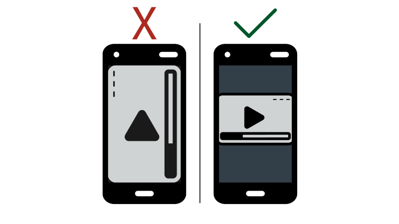
- Ensure important text or visuals within your media remain understandable when viewed in both portrait and landscape orientations.
- Avoid embedding text that becomes clipped or unreadable when a video is rotated.
- If content does not rotate, check for a control within the user face to change the orientation.
Orientation failure and success
The success criteria states that the purpose of each input field collecting information about the user can be programmatically determined when:
- The input field serves a purpose identified in the Input Purposes for user interface components section; and
- The content is implemented using technologies with support for identifying the expected meaning for form input data.
Key takeaway: Input fields must expose standardized purposes (autocomplete types) that browsers and assistive technology can understand. Forms must be accessible and use clear field labeling.
Sufficient techniques
How it applies to social media
- When linking to signup forms, event registrations, surveys, or landing pages from posts, confirm that fields are clearly labeled (“Email address,” “Name,” “Phone”).
- Avoid promoting forms that use vague or unclear field labels, which make autofill unreliable and create barriers for assistive technology users.
- When writing instructions in posts or stories (“Sign up using the form in our bio”), make sure the referenced form is accessible and uses clear field labeling before sharing.
The success criteria states that content can be presented without loss of information or functionality, and without requiring scrolling in two dimensions for:
- Vertical scrolling content at a width equivalent to 320 CSS pixels;
- Horizontal scrolling content at a height equivalent to 256 CSS pixels.
- Except for parts of the content which require two-dimensional layout for usage or meaning.
Key takeaway: Content must remain usable when viewed on small screens or large zoom (no horizontal scrolling).
Sufficient techniques
- Using media queries and grid CSS to reflow columns
- Using CSS Flexbox to reflow content
- Allowing for reflow with long URLs and strings of text
- Using CSS width, max-width and flexbox to fit labels and inputs
- Calculating size and position in a way that scales with text size
How it applies to social media
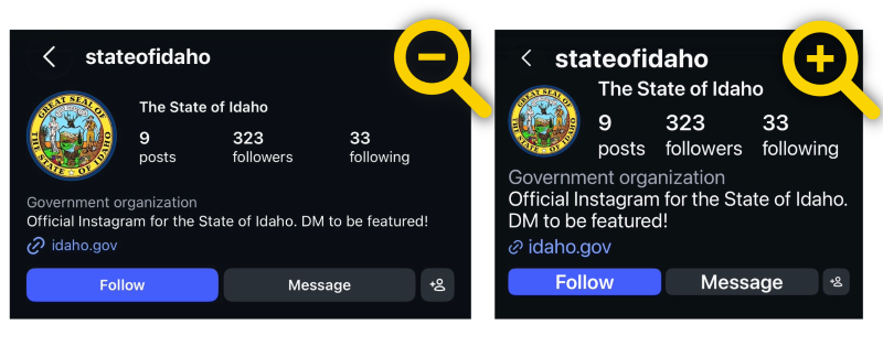
- Write captions that remain scannable in narrow layouts.
- Ensure text overlays in reels, stories, or images do not require horizontal scrolling.
- Avoid wide infographics that lose information when viewed on mobile.
Reflow success (no horizontal scrolling)
Tools
- Manually test by increasing display text size on mobile device.
- On iPhone
- Settings → Accessibility → Display & Text Size → Larger Text
- Slide the scale up
- On Android
- Settings → Accessibility → Text and Display → Font Size
- Increase the slider
The success criteria states that the visual presentation of the following have a contrast ratio of at least 3:1 against adjacent color(s):
- User Interface Components: Visual information required to identify user interface components and states, except for inactive components or where the appearance of the component is determined by the user agent and not modified by the author;
- Graphical Objects: Parts of graphics required to understand the content, except when a particular presentation of graphics is essential to the information being conveyed.
Key takeaway: Non-text elements (such as icons, controls, charts, graphic objects) must be visually recognizable with a contrast ratio of at least 3:1.
Sufficient techniques
For user interface components:
- Using an author-supplied, visible focus indicator
- Providing a control with a sufficient contrast ratio that allows users to switch to a presentation that uses sufficient contrast
For graphical content:
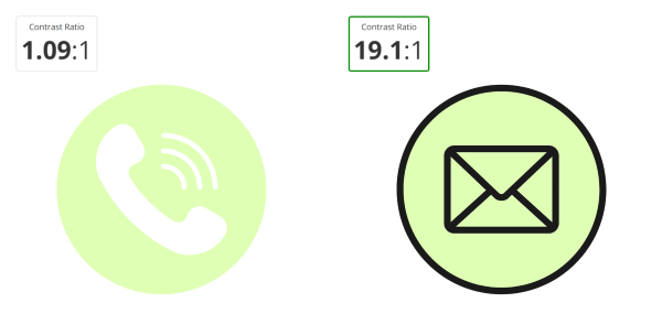
- Ensuring that a contrast ratio of 3:1 is provided for icons
- Provide sufficient contrast at the boundaries between adjoining colors
How it applies to social media
- When providing copy that includes embedded icons (e.g., “Select the ⚙ button”), ensure icons are meaningful and recognizable.
- Avoid relying solely on icons to convey critical instructions.
- When designing charts, graphs, or other elements in content, use high-contrast color palettes.
Icon color contrast failure and success
Tools
Examples of graphics the success criterion applies to
Icons, graphs, diagrams, and infographics are examples of graphic objects that are composed of lines or shapes and a limited color palette over which the content author has creative control. Content authors should ensure that these graphics conveying important information have a 3:1 contrast ratio against the background.
Note: Not every graphical object needs to contrast with its surroundings; only those that are required for a user to understand what the graphic is conveying.
Exceptions
- If a graphic contains text that is embedded or overlayed and conveys the same information. An example would be the labels and values on a bar graph.
- The graphic does not convey any meaningful information and is for decorative purposes only.
- The information is available in another form.
- The graphic is part of a logo or brand name.
The success criteria states that in content implemented using markup languages that support the following text style properties, no loss of content or functionality occurs by setting all of the following and by changing no other style property:
- Line height (line spacing) to at least 1.5 times the font size;
- Spacing following paragraphs to at least 2 times the font size;
- Letter spacing (tracking) to at least 0.12 times the font size;
- Word spacing to at least 0.16 times the font size.
Exception: Human languages and scripts that do not make use of one or more of these text style properties in written text can conform using only the properties that exist for that combination of language and script.
Key takeaway: Text overlays and captions must work when spacing is increased.
Sufficient techniques
How it applies to social media
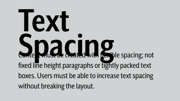
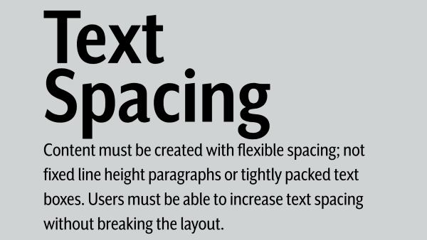
- Ensure text overlays in story slides do not overlap or cut off when spacing increases.
- Avoid tightly packed text in carousels or infographics.
- Use generous padding around on-image text.
- Avoid embedding text in images when possible and use real text.
Text spacing failure
Text spacing success
The success criteria states where receiving and then removing pointer hover or keyboard focus triggers additional content to become visible and then hidden, the following are true:
- Dismissible: A mechanism is available to dismiss the additional content without moving pointer hover or keyboard focus, unless the additional content communicates an input error or does not obscure or replace other content;
- Hoverable: If pointer hover can trigger the additional content, then the pointer can be moved over the additional content without the additional content disappearing;
- Persistent: The additional content remains visible until the hover or focus trigger is removed, the user dismisses it, or its information is no longer valid.
Exception: The visual presentation of the additional content is controlled by the user agent and is not modified by the author.
Key takeaway: When additional content appears on hover or focus, it must remain visible when the pointer is over it, not disappear immediately when moving to the tooltip, and be dismissible.
Sufficient techniques
How it applies to social media
- Ensure tooltips and pop-ups remain open long enough for reading.
- Enable keyboard access to tooltip-triggered insights.
- Avoid hover-only access — provide click or focus equivalents.
Tools
- Manually test the component with keyboard navigation (Tab / Shift+Tab)
The success criteria states that if a keyboard shortcut is implemented in content using only letter (including upper- and lower-case letters), punctuation, number, or symbol characters, then at least one of the following is true:
- Turn off: A mechanism is available to turn the shortcut off;
- Remap: A mechanism is available to remap the shortcut to include one or more non-printable keyboard keys (e.g., Ctrl, Alt);
- Active only on focus: The keyboard shortcut for a user interface component is only active when that component has focus.
Key takeaway: Social media content writers must prevent accidental triggers by users with alternative input methods and no single key shortcuts.
Sufficient techniques
How it applies to social media
- Make sure character-only shortcut keys can be turned off/modified using one or more modifier keys.
- Scope shortcuts to focused elements only.
- Ensure that any keyboard shortcuts used in social media content creation tools (e.g., custom scripts, templates, or scheduling platforms) do not rely on single printable keys that could accidentally trigger actions for users with assistive technologies.
Tools
- Review any custom workflows, automation scripts, or browser-based tools your team uses and confirm they don’t rely on single-key shortcuts.
The success criteria states that all functionality that uses multipoint or path-based gestures for operation can be operated with a single pointer without a path-based gesture, unless a multipoint or path-based gesture is essential.
Note: This requirement applies to web content that interprets pointer actions (i.e., this does not apply to actions that are required to operate the user agent or assistive technology).
Key takeaway: Interactive content must not rely on multi-touch gestures for essential interactions.
Sufficient techniques
- Providing controls to achieve the same result as path based or multipoint gestures
- Providing single point activation for a control slider
How it applies to social media
- Most interactions can be accomplished with simple gestures. There are some instances that may require complex actions like pinch, rotate, or two-finger pan that must have a simple pointer alternative.
- When embedding interactive polls or sliders, ensure they can be activated with a single tap.
- Avoid designing stories or interactive content that rely on custom gestures.
The success criteria states that for functionality that can be operated using a single pointer, at least one of the following is true:
- No Down-Event: The down-event of the pointer is not used to execute any part of the function;
- Abort or Undo: Completion of the function is on the up-event, and a mechanism is available to abort the function before completion or to undo the function after completion;
- Up Reversal: The up-event reverses any outcome of the preceding down-event;
- Essential: Completing the function on the down-event is essential.
Key takeaway: Users must be able to cancel or avoid accidental activation of touch interactions. A tap should not trigger immediate irreversible action.
Sufficient techniques
- Ensuring that drag-and-drop actions can be cancelled
- Using native controls to ensure functionality is triggered on the up-event
How it applies to social media
- Avoid single‑tap actions that immediately trigger something important.
- Make sure key actions happen on the “up‑event” so users can cancel accidental taps.
- Provide simple undo or confirmation options for posts, deletes, or submissions.
- Ensure drag‑and‑drop actions in scheduling or asset tools can be cancelled.
- Test mobile interactions to confirm accidental touches don’t cause irreversible actions.
The success criteria states that for user interface components with labels that include text or images of text, the name contains the text that is presented visually.
Note: A best practice is to have the text of the label at the start of the name.
Key takeaway: Accessible names for controls must contain the visible text labels so voice-control users can operate them using exact spoken commands. This is critical for videos or graphics with voice commands.
Sufficient techniques
- Including the text of the visible label as part of the accessible name
- Matching the accessible name to the visible label
How it applies to social media
- When directing users (“Select the download button”), ensure the visible label matches your instructions.
- Avoid using alternate phrasing that differs from the platform’s control name.
Example
- You write instructions “Tap ‘Send Message’ to contact us.”
- For voice-control users, if the actual control in Instagram or Facebook is labeled “Message,” they would have to say “Tap ‘Message.’”
- Your instructions “Send Message,” doesn’t match the platform’s control. Match your text to the real label.
- Correct instruction: “Tap ‘Message’ to contact us.”
The success criteria states that functionality that can be operated by device motion or user motion can also be operated by user interface components and responding to the motion can be disabled to prevent accidental actuation, except when:
- Supported Interface: The motion is used to operate functionality through an accessibility supported interface;
- Essential: The motion is essential for the function and doing so would invalidate the activity.
Key takeaway: If content uses device motion for interactions (such as shaking, tilting, rotating, etc.), users must have non-motion alternatives and be able to turn off motion controls.
Sufficient techniques
How it applies to social media
- Avoid promoting interactive effects or experiences that require users to move their phone unless there is also a simple tap option.
- When writing instructions, use accessible wording like “Tap to start” rather than “Tilt your phone to begin.”
- If you work with vendors who create interactive content, confirm that any motion‑based features have an easy non‑motion alternative before you share or promote them.
- Ensure that all users can participate in interactive content, including people who cannot physically move their device or who have motion sensitivity.
The success criteria states that in content implemented using markup languages, status messages can be programmatically determined through role or properties such that they can be presented to the user by assistive technologies without receiving focus.
Key takeaway: Status messages (e.g., form confirmations, loading indicators, logins) must be announced to assistive technology without losing their keyboard focus.
Sufficient techniques
- If a status message advises on the success or results of an action, or state of an application:
- If a status message conveys a suggestion or warning on the existence of an error:
- Using ARIA role=alert or Live Regions to Identify Errors in combination with any of the following techniques:
- Providing text descriptions to identify required fields that were not completed
- Providing a text description when the user provides information that is not in the list of allowed values
- Providing a text description when user input falls outside the required format or values
- Providing suggested correction text
- Providing spell checking and suggestions for text input
- Using ARIA role=alert or Live Regions to Identify Errors in combination with any of the following techniques:
- If a status message conveys information on the progress of a process:
How it applies to social media
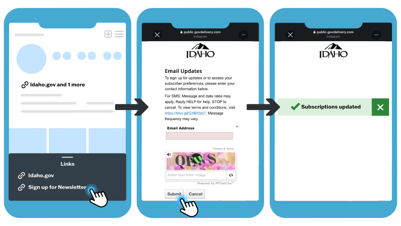
- Ensure any landing pages, microsites, or forms linked from posts provide clear, accessible status messages (for example: “Form submitted,” “Subscription confirmed,” “Error — email required”).
- Confirm that confirmation or error messages on linked pages are announced to screen‑reader users without moving focus.
- Test embedded polls, signup modules, or other interactive components to make sure they announce changes such as “Vote recorded,” “Loading,” or “Success.”
- Coordinate with developers or platform owners to ensure status messages are implemented using accessible techniques (such as ARIA “status” or “alert”) on any external content referenced in posts.
Successful status message
- User clicks on the link in the Instagram profile bio to sign up for the newsletter, enters their email address, clicks the submit button, and receives a successful status message.